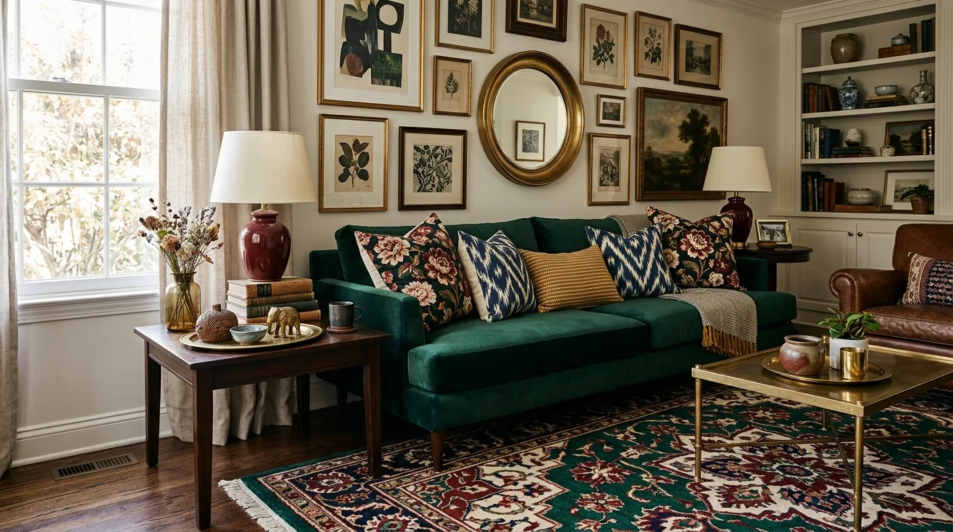
Maximalist interiors can feel vibrant, layered, and deeply personal—without tipping into visual noise. The difference between “collected” and “cluttered” usually comes down to a few repeatable rules: clear anchors, a simple hierarchy, and a handful of consistent through-lines that quietly keep everything in line. If you love the look but want it to feel livable, start with structure, then add abundance on purpose. For more guidance, see 2025 FIT MFA NYFW Show – Fashion Institute of Technology.
For a step-by-step framework you can reuse room to room, the Maximalism Made Elegant digital guide breaks down color, pattern, styling, and practical ways to turn AI inspiration into a real-home plan. For further reading, see GlassIO: Long-Term In-Home Study of Hybrid Craft Through ….
Elegant maximalism isn’t about owning more—it’s about making “more” look intentional. In a real home, that polish typically shows up in five ways:
If you want more foundational decorating guidance before you go bold, sources like Architectural Digest’s decorating ideas can help clarify what to prioritize first (layout, scale, and lighting) so the layers land well.
Maximalism gets easier when you give your eye a predictable structure. A reliable approach is the 70/20/10 method—simple enough to remember, flexible enough for any style.
This is also where “quiet anchors” do heavy lifting: a consistent metal finish, a recurring wood tone, or a signature shade (like oxblood, emerald, or navy) that appears in both big and small ways.
Patterns can absolutely mix—when scale, contrast, and “pause points” are doing their jobs. Start by choosing a foundation pattern family that matches your taste (and your tolerance for contrast).
| Anchor pattern | Best supporting patterns | Safe neutral “pause” |
|---|---|---|
| Bold stripe | Painterly floral, small check | Nubby linen or solid velvet |
| Large floral | Thin stripe, subtle geometric | Matte wool or boucle |
| Graphic geometric | Organic abstract, tonal texture | Solid cotton/linen in a mid-tone |
| Vintage motif | Simple stripe, tone-on-tone damask | Washed neutral or warm wood |
When the mix still feels “loud,” add one mid-tone solid (not white) to act as a bridge. Mid-tones—camel, mushroom, olive-gray, ink—make maximalism feel more tailored than high-contrast black-and-white breaks everywhere.
Elegance often comes from editing and finish choices—not from removing personality. If you want a room to read polished, treat materials like punctuation.
If you enjoy the historical side of ornament and why certain motifs feel “rich,” the Metropolitan Museum of Art’s Heilbrunn Timeline of Art History is a surprisingly useful rabbit hole for pattern context and references.
For a statement moment that still feels clean-lined, a strong furniture silhouette does wonders—especially in open kitchens. A Luxury adjustable swivel bar stool for a statement kitchen island can act as a “designed” anchor piece that supports bolder art, lighting, or tile nearby.
Keep a clear hierarchy with one focal point, build the room around strong anchors (rug, sofa, curtains), and repeat key colors or finishes so the mix feels intentional. Leave negative space around hero pieces, and swap many small accessories for fewer, larger ones.
Use one anchor pattern, then add two supporting patterns in different scales (large/medium/small). Add solid textures (like linen, velvet, or bouclé) as “pause points,” and keep either the color family or the pattern scale consistent.
Extract a repeat list of colors, materials, and shapes from your favorite image, then confirm what actually fits your room’s measurements and budget. Choose one hero purchase first, then add compatible layers that match your repeat list.








Leave a comment